")
Device-Independent Responsive Design
The Goldilocks idea of responsive website design deserves some attention. The basic idea is that web designers have been thinking about designing for different devices completely wrong. Instead of focusing on building a website to comply with the metrics of various devices currently on the market (for example, designing for Apple: iPhone, iPad, G4, iMac, iPod, etc.) we should instead be taking the approach of designing independent of devices and focus on grid layouts that will be now and future-proof. Let me ellaborate…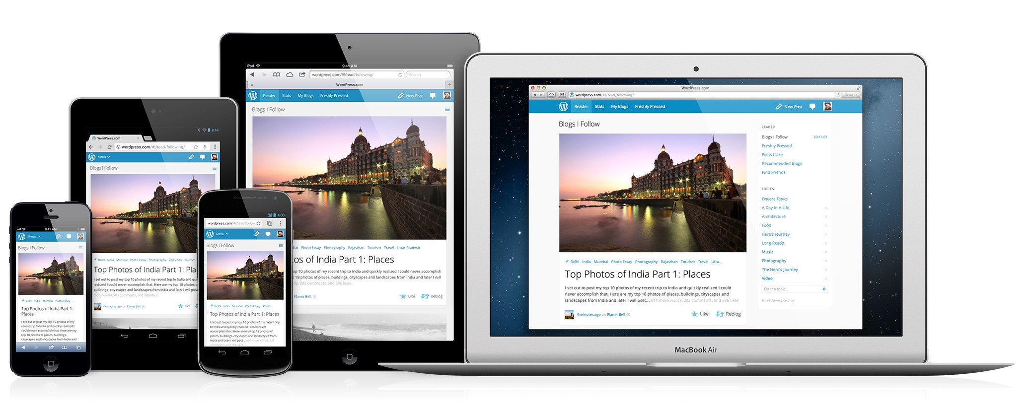
The current methodology of responsive design uses media queries to discover what resolution the browser is using when it accesses the website. The designer then uses CSS styling to provide for a range of pixel resolution. So in essence, three different resolutions are created: one for phones, one for tablets, and one for desktops. The problem is that not every device is going to conform to the arbitrary limits we set in the CSS code.
For example, let’s say that the CSS is set, with a media query, to filter all devices with resolutions of less than 320px to use the phone CSS stylings. That is great for most smartphones, but what about larger phones (like the Samsung Galaxy Note)? Larger smart phones are going to be lumped into the next highest resolution media query which is the tablet CSS stylings. This might be set arbitrarily to 640px max width. Devices with resolution just over 320px are not going to be optimized very well using this format. The result is lower readability which translates to a higher bounce rate and less interaction.

Goldilocks
The idea for goldilocks is simple and is named after a classic children’s story involving three bears and some porridge. You don’t want porridge that is too hot or too cold. You want porridge that is warm and enjoyable. Your responsive design should be the same.
By ignoring particular devices altogether, we accomplish two very important things as website architects. First, we have simplified the process. There is no longer any need to fret over different devices and redesigning after a new device is introduced to the market (which happens quite frequently these days). Instead, we have a design that will stand the test of time and work equally across devices that are here today as well as ones that are yet to come.
Secondly, we eliminate client concerns over website accessibility. No longer do you have to hear this during the review process, “It looks great on my Wife’s iphone, but it is a bit jumbled on my Droid”. It will just work, and seamlessly.
How does it work?
The idea is that you have a grid layout, as is typical with wireframing these days (ie. Twitter). The difference is that you optimize for a single column. Using em (not pixels!) in your CSS allows you to be more flexible and if you need to nudge the margins a little, you can. Designing for a single column doesn’t mean that you can’t have a two-column layout, or three-column layout for that matter.
The saying goes that pictures speak a thousand words, so take a look for yourself. Here is a demo from the goldilocks website.
https://goldilocksapproach.com/demo/
If you use your browser’s zoom function, then you can see that it scales quite nicely.
The Goldilocks website provides boiler-plate HTML and CSS for you to play around with (or design with!). I have yet to do either, but am going to do so after writing this blog.
What do you think? Is this the best method for responsive design? Do you know of an even better method? Let us know by leaving a comment.