")
Back in April of this year (2015), Google made changes to its algorithms that aims to punish sites that are not mobile-friendly. This has been dramatically named “Mobilegeddon”. As you can see from the chart, many sites were punished by this and their rankings have fallen.
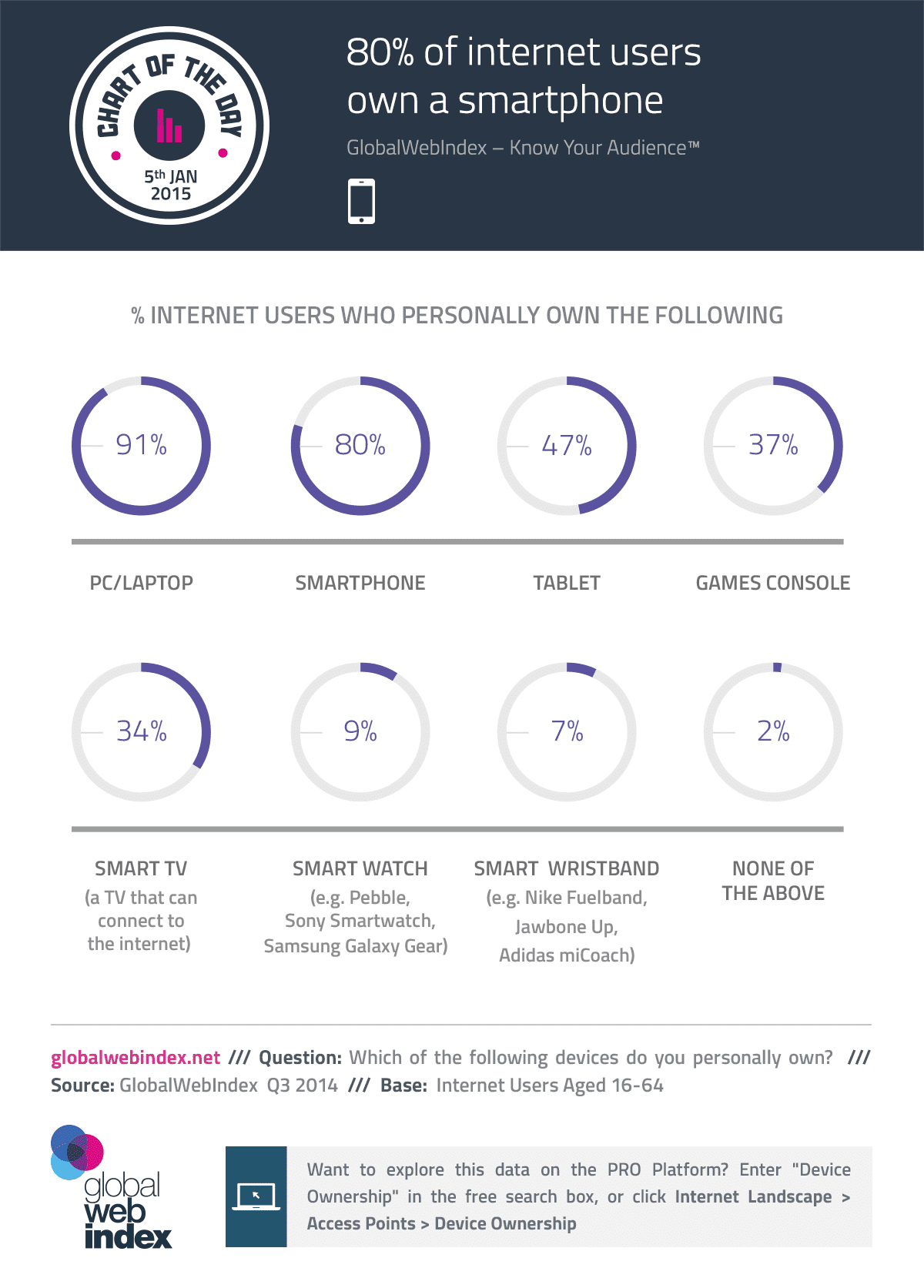
Google’s reasoning behind this is sound. Mobile web browsing has exploded in recent years. As the graphic shows, 80% of internet users own a smartphone. In its ever present quest to provide the best user experience for their users (searchers), Google has made it clear that sites that do not provide a good user experience across devices will not rank as high as those that do.

There was initially a lot of confusion about how this change would affect sites. So far in the last few months, some sites have seen dramatic shifts and some sites have not budged at all (though that just may be a matter of time). What is clear though, from Google’s own words, is that the only searches that should be affected are those done on mobile.
“We’re boosting the ranking of mobile-friendly pages on mobile search results. Now searchers can more easily find high-quality and relevant results where text is readable without tapping or zooming, tap targets are spaced appropriately, and the page avoids unplayable content or horizontal scrolling.”
(source: Google)
So, we are seeing sites that are not mobile-friendly drop in ranking for searches on mobile devices while not neccessarily losing ranking on desktop searches. This creates a perceptual problem as most rankings are historically tracked in regards to desktop computers. Thus, a site that is having its ranking meticulously monitored might not even notice that their mobile ranking has dropped precipitously.
What does this mean?
All of this simply means that it is imperative to have a mobile-friendly website these days. Since the mobile trend continues to rise and does not appear to be slowing down, this will become more and more important. Some websites are even taking a “mobile first” approach to site design. This means that a website is built first for mobile screen sizes and the scaled up to desktop screen sizes afterwards (the opposite is the current paradigm).
By far the best solution going forward for most websites is to implement a responsive design. This allows the website to be displayed perfectly on any screen size. This is our philosophy here at Atlantis Website Design and is currently the recommendation from Google.
Other options?
Besides ignoring mobile devices altogether (which is foolish at this point), there are 2 other options: 1) a dedicated mobile site and 2) a mobile app in-lieu of a mobile-friendly site. Each of these have benefits and setbacks. But overall, neither option solves the problem as well as responsive design for a holistic solution. Here is why.
Dedicated mobile site
Dedicated mobile sites were all the rage back in the days before responsive design when mobile usage was just picking up steam. The basic concept was that the website would detect when a user was using a mobile device and then would serve up an entirely different site that was optimized specifically for mobile devices.
This worked ok at first, but designers started running into problems rather quickly when the amounts and types of devices started to drastically increase. Which site should be shown for an ipad or any other device that didn’t fit perfectly into the “mobile only” or “desktop only” categories?
Enter responsive design. The responsive design revolution helped usher in what is now known as “device agnostic design”. We can now design one site that conforms to any screen size available now, or in the future. (within reason)
Mobile apps
Mobile apps are great and certainly have their place. But when it comes to an actual website, forcing users to download and install your app to enjoy a mobile-friendly experience from your brand is a lot to ask. Smartphone users have grown wary of installing yet another app on their phones. An app adds to the clutter of already sparse screen real estate. They take up increasing amounts of storage space. They can also present a lot of security problems that are easier to avoid in a traditional web setting.
Furthermore, app development is beyond the reach of most SMBs. A mom-and-pop clothing store simply doesn’t have the budget for app design like big brands (Macy’s). Even after the app is built, maintaining it across hundreds of types of devices is a headache.
Again, mobile apps definitely have their place and some of them are quite good. The best ones truly make for a better user experience than the website can provide. So, while they can be the superior option, they are not as good and universal as responsive design for most websites and businesses.
Test a Website
You can use the following Google tool to test how mobile-friendly a website is according to Google.
Google Mobile-friendly Test Tool
In Summary
It is essential to have a website that displays well across all device screen sizes. Ignoring mobile device compatibility puts your rankings at risk which in turn can lead to less website visitors. Although a few options exist for dealing with different screen sizes in today’s world, none are universally better then responsive design.
If your site is suffering from Mobilegeddon, let us help. We would be happy to redesign your site for responsive design. We can also retrofit existing designs to become responsive if you already like the design you have. If for some reason you don’t want responsive design, we will happily build a mobile-only site to meet your needs.
Contact us today for a free consultation and be ready for the future, as well as today.